As a retail business owner, setting up product displays in-store or at events like a market, fair, or festival can be fun—and a ton of work, too. The details of your setup from signage all the way down to your product price tags, can make or break your sales if not planned carefully.
That’s where visual merchandising tips can help. You can use these best practices to plan out your retail space or when setting up a table or booth display at an event, whether it’s a festival, trade show, or market.
With a little effort, planning, and these 10 visual merchandising tips, you can create a smart, engaging display in-store or at your next event that will also maximize your sales and bring in new, and potentially regular, customers.
1. Know your customer
Before diving into what your display will look like, first considerwho you’re setting it up for. If you’re doing visual merchandising for your retail store, you know who your ideal customer is.
If you’re setting up a booth at an event, research the other vendors, events from previous years, and the hosting company or organization to better understand the event’s mission. This will help you come to a conclusion about whether or not the event is right for your brand.
💡PRO TIP: Before you sign up to sell your product at events, first contact the event organizers to ask for some of the demographic information on attendees. If you’re trying to sell dainty jewelry at a hot sauce market, you probably won’t reach your sales goals.
Regardless of whether it’s for your brick-and-mortar location or an event you’re considering attending, run through these questions to make sure your visual merchandising attracts the right customers:
- What’s the age range of the demographic?
- What do you think their income is?
- What brings them to your store or the event?
- What hobbies or interests do they have?
2. Create a theme
Now that you’ve outlined who you’re setting up in-store or event displays for, it’s time to brainstorm a theme. It could be a seasonal theme like BKLYN Larder’s autumn vibes display or whatever type of theme makes sense for your retail business.
But first, it’s important to remember one popular visual merchandising tip: whether it’s in your brick-and-mortar store or at an event, your display should tell a coherent story or a visual message.
A great place to start is to find a group of colors that work well together. You might already have a palette of colors you regularly work with as part of your branding.
If complementary colors first came to mind, you’re certainly not alone. However, there are actually more types of color schemes you can use that might better suit your display. In fact, opposite colors can actually be distracting when used incorrectly.
Using the color wheel concept, here are four color schemes to help you decide which groups of colors will look best for your store or at an event booth or table:

- Complementary colors are opposite of each other on the color wheel. This color scheme helps add vibrancy to a focal point. E.g.,Purple and yellow.
- Analogous colors are next to each other on the color wheel. This color scheme helps add warmth and cheer. E.g., Blue, purple, and magenta.
- Triad colors are evenly spaced around the color wheel, forming a perfect triangle. Like complementary color schemes, triad colors add vibrancy but use the other two colors as accents for balance. E.g., Purple, orange, and green.
- Tetradic colors use four colors on the color wheel, making a perfect rectangle. This color scheme is very rich, allowing one color to be dominant and creating a balance between cool and warm colors. E.g., Red, orange, green, and blue.
To help determine which color scheme to use, begin by thinking about how you want your customers to feel when they walk into your store or booth. Then, consider how your color theme complements your brand and the products you’ll be showcasing. This will help you pinpoint the visual message that’s best suited for your display.
For example, if you sell natural goods, a nature theme is a perfect visual message. Highlight your display with beautiful foliage, fresh flowers, and green, blue, and brown tones. Having a cohesive theme will help your items feel relevant and natural, too.
💡 PRO TIP: If it fits within your theme, consider adding fresh flowers. It’s scientifically proven to make people feel comfortable and relaxed.
3. Keep it simple
As the next point in the planning stage, you’ll start to put the initial components of your display together. But first thing’s first: keep things simple, clean, and tidy. Organization generally leads to attractive displays.
In the case of displays and booths at event sales, less really is more. Neat and organized displays allow your items (and the product information) to really shine, which means customers won’t be distracted by clutter.
Easy-to-see equals easy-to-buy.
You may also like to read our guide to cross merchandising. Learn what it is, why it’s important, and how to implement it in your store.
4. Turn on the lights
Light creates a visual interest, and it helps highlight the focal points in your display’s message. For items you really want passersby to notice, try using accent lights to draw their eyes to the product. Shopify merchant The Inspiration Company does a great job lighting its stores to catch the eyes of potential customers.
 And if you’re opting to use a display wall or tall shelving, highlight those areas with lights as well, since higher-up items are generally the focal point for customers.
📚 FURTHER READING: Need more guidance on creating the perfect lighting? Use our guide to create an ambiance that encourages sales.
5. Find a balance
It’s important to note that not everything can be a focal point in your display. You must be able to create a balance between the attention-grabbing pieces and accent pieces. Shopify merchant Bathu achieves this with a balanced window display. A set of three fixtures at different heights on a white background with a focal point make this display eye-catching, but not overwhelming.
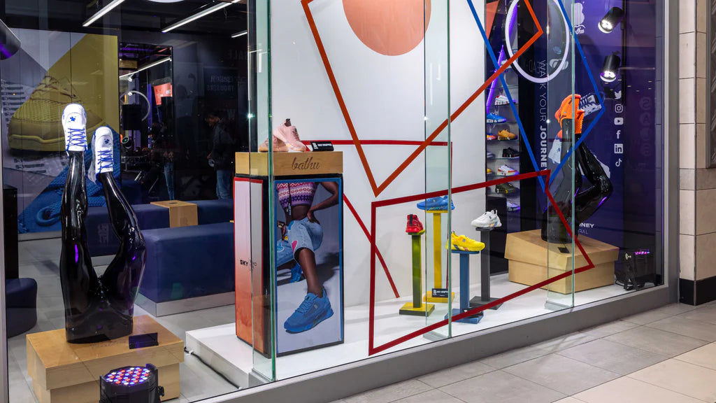 To do this, remember one of the most common visual merchandising tips: the rule of three. This rule is all about creating symmetry (or balance), based on research that suggests the human eye tends to consider symmetry more attractive.
For example, having three items in a row with the middle up a bit higher creates a balance between the three products, allowing the middle product to be the focal point and the two on each side to accent it. In this case, the middle product should be a brighter color or a larger item to help grab attention in key areas of your display.
Next, consider the fixtures you want to utilize. While shelving and props will allow for more space to display your products, you want to ensure that you’re not overwhelming your customer with a ton of merchandise. So use additional fixtures sparingly and effectively to maintain the balance throughout your store or booth.
Here are a few things to consider to use fixtures effectively in your display:
- Position fixtures to help put products in your customers’ lines of sight
- Ensure the fixtures won’t get in the way of your customers
- Use fixtures to draw attention to specific products
- Match fixtures to your theme to help promote a cohesive look
Lastly, don’t forget the signage. A poorly placed sign can ruin your balance instantaneously, so its location needs to be strategic. Event signage shouldn’t disrupt the flow of the booth, but it should be large enough for customers to see it from a distance. If you have a retail store, in addition to displaying the name of your business out front, you may have more signage throughout the store to guide customers from bestselling products to new arrivals to the fitting room, and so on.
6. Show your price
This one might be a bit obvious, but it’s something a lot of retailers forget—particularly when setting up at an event: the price tags. When you’re shopping, what do you think when you pick up an item without a price tag? It’s probably very expensive.
So, whether it’s at your brick-and-mortar store or at an event, don’t make your customers guess—otherwise, they might think your product is out of their budget.
Try out these methods for adding price tags to your merchandise:
- DIY. Creating your own price tags will not only cut back on expenses but also add another creative element to your table. You can buy simple white tags, choose a unique string, and stamp your logo on the front.
- Barcode printers. Available at a variety of price points, barcode printers (or label printers) provide a quick, easy, and professional approach to adding prices to your wares.
- Templates. A quick Google search for price tag templates will lead you to countless options that you can print yourself at home.
- Labels. If you’re strapped for time or cash, pick up some small labels from a nearby office supply store and neatly handwrite the price yourself. This approach may be simple, but it can still add some personality to your display.
💡 PRO TIP: If you’re using stickers for your price tags, ensure that they can be easily peeled off so the sticker doesn’t affect your merchandise.
7. Get creative
With all of the intricacies of visual merchandising, there’s still fun to be had. Adding a spark of creativity to your in-store visual merchandising or your event booth can help increase customers’ interests in your products, and it can help make the process more exciting for you.
 It could be as simple as the flickering light from a few candles to add a bit of animation, a neon sign like Shopify merchant SeaVees, or a tablet that showcases your business or even lets customers interact with your brand.
8. Plan your display
Now, it’s time to plan it all out—and that’s where a planogram comes in. A planogram is a diagram that pinpoints the placement of retail products in an effort to maximize sales. It’s the perfect visual merchandising tool to help you decide where and how to display your products, not only to support your brand’s visual message but also to increase sales at events and in-store.
If you don’t know where to start, or are even intimidated by the word, don’t fear. Many companies have created easy-to-use software programs that help you create planograms of your own, like:
Most include intuitive, well-designed interfaces that are made to optimize your space and sales. SmartDraw and Shelf Logic offer free trials, too.
If purchasing software isn’t within your budget, many opt to make their own planogram with pen and paper. Here’s how you can do it too:
- Use the dimensions of your store, booth area, or table to draw a simple floor plan on a piece of paper with the length listed for each side.
- Physically place the merchandise you want to sell in an open area that mimics the space you’re working with. Play around with different arrangements, keeping your theme and focal points in mind. This will also help you determine if you need any additional tools, like shelving and stands.
- Once you’ve landed on an arrangement, draw out your items on your planogram to scale, using a half inch for every foot. And, remember to label each one and don’t forget to account for your business’s signage.
9. Come prepared
When you follow these visual merchandising tips, your display items will surely go to a new home quickly. So, you’ll want to come prepared so you can replenish your stock.
If you don’t keep additional inventory in your store’s stockroom or come to events with additional items, your displays could start to look empty. According to Angie Bell, author of Retail Rebranded: Twenty-Seven Secrets of Market Leaders, a negative space has a number of undesirable consequences. “Out-of-stock [items] inconvenience your customers and so they are more likely to go to one of your competitors for what they need,” she says.
Being prepared also comes with additional boxes of merchandise. Remember to keep boxes out of sight to prevent looking cluttered and out of the floor space so your customers are able to move around with ease.
10. Be engaging
Lastly, be welcoming to your customers—and remember, you’re not limited to standing behind the table at an event or staying glued to the checkout counter at your retail store. Instead, step out onto the sales floor, invite customers in, and strike up a conversation.
📚 FURTHER READING: Want more tips on making the most of your event sales? Learn how to nail the in-person selling experience.
Get started with these visual merchandising tips
Visual merchandising isn’t limited to only brick-and-mortar stores. You can also make it work for your business at events like markets, festivals, and even trade shows, no matter the space you’re working with.
With these 10 visual merchandising tips, you can create the most engaging display for your business, down to the minor detail.
Additional research and content from Alexis Damen.
Read more
- Why Your Store Needs a Size Chart (And How to Create One)
- Slow Shopping: Why Retailers Should Focus on Discoverability In-Store
- 12 Retail Window Displays that Drive Sales
- Let There Be Light: Retail Lighting Designs to Encourage Sales
- Product Testing: What It Is, Methods, and How to Create a Testing Process
- Line Busting Strategies Every Retailer Needs To Know
- Product Merchandising: 11 Ideas to Steal (+3 Examples)
Visual merchandising tips FAQ
What do you mean by visual merchandising?
Visual merchandising is the practice of using visual elements such as windows displays, store layouts, and product displays to attract customers and maximize sales. It’s based on the idea of creating an appealing visual environment that will draw customers in and help them make purchasing decisions. Visual merchandising is used in a variety of retail stores and is especially important for clothing stores, as it helps customers identify the latest styles and trends.
What are the four elements of visual merchandising?
- Store Layout. This refers to how the space within the store is organized. It should be designed to maximize the visibility of merchandise, create traffic flow, and draw attention to key merchandise displays.
- Displays. This is the actual presentation of merchandise. Displays should be engaging and create an inviting environment that encourages customers to browse and make purchases.
- Lighting. This refers to the use of lighting to highlight merchandise and draw customers’ attention. It should be used strategically to create a certain atmosphere and to emphasize specific products.
- Signage. This refers to the use of signs, banners, and other visual aids to promote products and create a cohesive look for the store. Signage should be used to direct customers and provide information about products, promotions, and sales.
