When customers walk through your door, you have a limited amount of time to make a good first impression — one that encourages shoppers to come in and stay awhile. Customers make a subconscious judgment about your brand within 90 seconds of entering your store. In the retail world, those are high stakes. Your store’s success depends on capturing the attention of shoppers.
A high-impact visual display has the power to entice customers and boost your sales. That’s why successful retailers put emphasis on an accenting a “power wall” within their stores. More than a simple wall display, a power wall helps draw customers in and channel their attention toward the items you want them to buy.
Not sure how to build an effective power wall that grows your bottom line? We’ll walk through creating a power wall display for your retail store that captures shopper attention and channels it into more sales.
Command Shoppers’ Attention
All the time and energy you put into creating a power wall is for naught if your display can’t command the attention of shoppers. Successful power walls grab customers by the eyeball and keep them interested. We’re talking about jumping out at customers, making them diverge from their route, and walk over to get a closer look.
Play to shoppers’ natural tendencies and take a few tips from retail psychology, and you can command that kind of attention with your store’s power wall.
In, And To The Right
In North America, the vast majority (up to 90%) of retail shoppers automatically turn to the right after walking into a store. That makes the front right wall of your store a prime location to hook customers and why most store layouts feature a power wall to the right of the entrance. It’s your first and best opportunity to capture shopper attention and draw them further into your store.
Make the most of this natural tendency by using this space for your store's power wall — showcasing popular, seasonal, and high-margin products right where customers are looking.
Use the Whole Wall
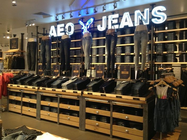
When most of your displays look the same, it can be hard to really command shopper attention with the same setup. Your power wall needs to stand out. That’s why it should be visually distinct — in at least one way — from other displays in your store.
One of the best ways to make your store's power wall jump out at customers is to use the whole wall. Make the display taller, wider, and more eye-catching than the rest of your store. Shoppers should be able to see the wall — and know what’s available there — from the moment they enter the store.
Take a hint from big retailers (like American Eagle) and use repetition along your store's power wall. Repeating the same product along the entire wall builds emphasis and leads the customer’s eye from one end to the other, creating visual interest.
Let There Be Color
The psychology of color plays a huge role in retail merchandising. That’s why you’ll see common color themes throughout retailers (like red “Sale” signs and green labels on organic products.)
As we mentioned earlier, when shoppers walk into your store, you have a limited amount of time to make a first impression. Research shows that color alone contributes to between 62% and 90% of that impression.
Color does more than command attention — it makes shoppers feel something. Red, for example, creates a sense of urgency. That’s why it’s often used in sale and clearance displays. Black conveys power and sleekness, making it ideal for marketing expensive or luxury products.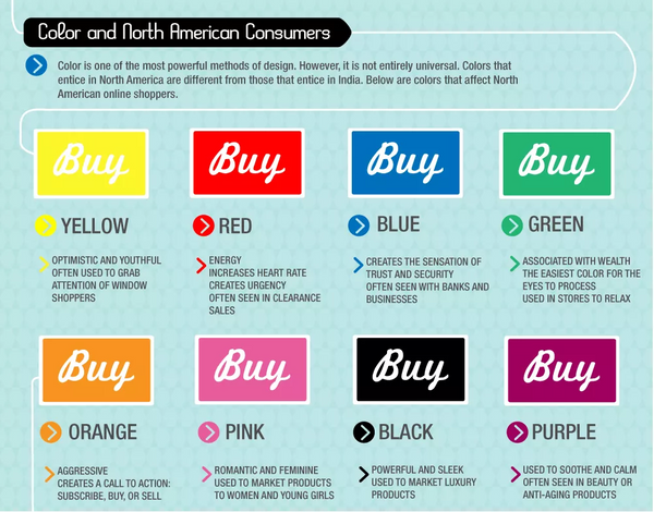
Your power wall should draw on bold, contrasting, and seasonal colors to command shopper interest from the moment they glance to the right. Any color can draw attention given the right contrast — bright reds, oranges, and blues are a safe bet for getting customers to take notice.
A few ways to up the color ante:
- Paint the wall behind your display a bright color
- Organize products to create a spectrum or gradient
- Use neon signage
- Change up the dominant color with each season (pastels in the spring, deep red during the winter holidays, etc.)
Light the Way
Another way to lead customer attention straight to your store's power wall is by highlighting the wall — literally. According to studies about lighting’s effect on customer behavior, dynamic lighting (think spotlights) grew average sales per customer by nearly 2%. The same study found that warmer lighting encourages customers to spend more time in those areas of the store.
For your store's power wall, choose warm lighting that’s distinct from the rest of your store. That can include:
- A literal spotlight on the product display
- Backlighting to give products a glow
- Lit, neon signage
- Colored lighting
Buyer beware: Don’t go crazy with dynamic lighting. Too much and it loses its power over customer attention. Use dynamic lighting to highlight your store's power wall but sparingly throughout the rest of the store.
FURTHER READING: Learn more about how your store lighting can drive more retail sales.
Display the Right Products
You put a lot of time and energy into creating an attention-grabbing power wall display. It’s important to wield that power wall in a way that creates the most return on your investment. That’s why it matters what products you display there. You’ve won shopper attention and have limited space to capitalize on it — how can you use that space to boost sales and your bottom line?
- High-profit items: An obvious way to capitalize (literally) on your store’s power wall and the attention it captures is to display high-margin or high-profit products there. Nike stores often display sneakers on their power wall, because their profit margin is close to 70% on these items. By virtue of being high-profit, selling more of these items will grow your bottom line.
- Popular, in-demand products: Is your store the go-to for a specific type of product? For example, Old Navy sells a lot of $2 flip-flops — that’s why you’ll often see an entire rainbow wall of them in the lead up to summer.
If customers come to your store looking for your most popular or in-demand products, make them easy to find. Placing high-demand items on your power wall is another subtle way to make the most of shoppers’ natural tendencies and behavior.
Your store’s power wall generates traffic, creating the perfect opportunity to up- and cross-sell additional items. In the Old Navy example, you might find pricier sandals or floppy hats accompanying the power wall display.
- Seasonal items: Speaking of sandals and flip-flops, seasonal items are a perfect fit for your store’s power wall. They create interest and tend to be in high-demand during a given season, making them ideal for a power wall display.
In the same vein, don’t think of your store’s power wall as a set-it-and-forget-it space. To maintain the attention of return shoppers, change up the display regularly — including which items you place there and how they’re organized.
Tell Your Brand’s Story
Today, between online shopping and retail competition, there’s more to being a successful retailer than creating displays. And sales, themselves, aren’t always just about the transaction.
In order to grow your business, drive customer retention, and create sustainable bottom line growth, you have to craft a narrative around your brand. You have to tell a story. That’s why leveraging your store’s power wall for more than just merchandising is another way to boost sales.
FURTHER READING: Get more expert tips on how to tell your retail brand’s story.
Feature Flagship Products
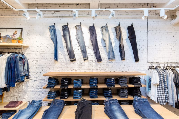
Speak to Your Mission
You’re in business for more than just selling products. Draw on your power wall’s signage, visuals, even paint to help convey what your brand stands for. Consider including a quote speaking to your passion or the store’s mission. The idea is to take the shopping experience beyond a transaction. Let customers know what they’re supporting when they buy from your store.
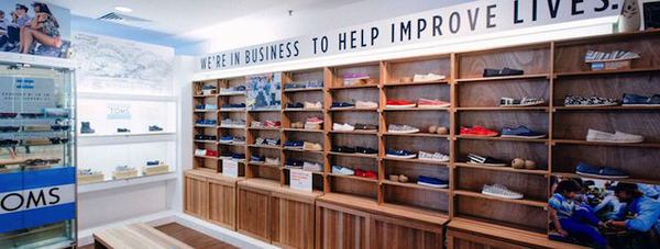
We’re in business to help improve lives.
Inspiration Ahead
With only 90 seconds to create a first impression on shoppers, your store needs to use every tool available to you. And a well-executed retail power wall is one of the powerful tools in your belt. It can help draw customers into your store, keep them in-store longer, tell your brand’s story...and yes, spike sales.
Ready to create a business-boosting power wall? Find inspiration for yours on Pinterest.
Read more
- Retail Design Tips and Trends for Your Store
- Displaying Your Merchandise: The Retailer's Guide To Mannequins and Body Forms
- Slow Shopping: Why Retailers Should Focus on Discoverability In-Store
- Why Your Store Needs a Size Chart (And How to Create One)
- How To Hire an Interior Designer for Your Retail Store (And Why You Need One)
- Let There Be Light: Retail Lighting Designs to Encourage Sales
- What Is a Planogram and Its Role in Visual Merchandising
- 10 Visual Merchandising Tips for Increasing Event Sales
- Product Merchandising: 11 Ideas to Steal (+3 Examples)
- Social Distancing Ideas for Business Owners: Creative Ways to Encourage Social Distancing In-Store
