Retail has been around for a long time, and there are endless ways to approach how you design your retail space. However, there are also some common design strategies all retailers should know to garner more sales.
From telling your brand’s story and creating immersive shopping experiences to putting together head-turning window displays and signage essentials, when it comes to retail, the devil is in the details.
Not sure where to get started with your retail design? Here, look at some of the basics for creating effective retail interiors that attract more customers to your store, get them browsing for more products, and encourage them to head toward the checkout.
What is retail design?
Retail interior design involves organizing and designing your retail space. It welcomes customers and guides them through your store.
At first glance, you may think retail design applies to how you merchandise your products. While merchandising is an important component of retail interior design, it’s not the only one.
From your store’s entryway to its checkout display, every element can impact your customer’s path to purchase. For that reason, retail interior design applies to your entire retail space.
The importance of retail design
Retail is on the rebound: According to the National Retail Federation (NRF), retail sales are forecasted to increase in 2024 by up to 3.5%—to a total of $5.28 trillion. Effective retail design helps you capture a piece of that pie.
Retail design directly impacts the customer experience, which then directly influences a shopper’s willingness to make a purchase. Effective retail design has the potential to positively or negatively impact your bottom line.
It also shapes the employee experience. Well-designed retail spaces make it easy for your team to do their job. A poorly designed retail space does the opposite and can mean high turnover and dissatisfaction.
Retail design tips for your store
The following tips for retail design will help you attract customers and provide an experience conducive to shopping and purchasing.
- Use color wisely
- Update product displays regularly
- Enter the threshold
- Create a power wall
- Pave a path for your shoppers
- Slow shoppers down
- Keep shoppers comfortable
- Make a comfy place to relax
- Spruce up your checkout counter
- Offer various payment methods
1. Use color wisely
When you hear “Target red,” “Home Depot orange,” or “Starbucks green,” you can picture the exact hue. Consumers connect with colors more than they consciously realize.
While a vibrant shop can create a bright, positive shopping experience, too much color can be overwhelming and cause shoppers to exit early. Sensory overload can make it difficult for customers to concentrate on your products and focus enough to make a purchase. It’s also unlikely that shoppers will return to your store if they don’t like the aesthetics.
To avoid this, thoughtfully incorporate color into your retail design. Consider the psychology of color. For example, black, a common color for men’s clothing stores, communicates authority and class. Red grabs attention and encourages impulse purchases. (Target, anyone?) On the other hand, blue is for calmness, security, and trust, which is why many banks use blue.
Lastly, when it comes to color, let your products speak for themselves. Avoid adding additional colors through decor, flooring, or signage. In the world of retail, less is almost always more.
2. Update product displays regularly
Product displays, otherwise known as visual merchandising, are proven to increase sales. Shoppers can examine your products “in action”—a hanging plant, staged living room, or dressed mannequin—to help them decide to purchase.
Displays also provide interactive shopping experiences and easy opportunities for user-generated content (UGC)—aesthetically pleasing displays encourage shoppers to share photos of your store on social media.
The most common retail design displays include window displays, checkout displays, point-of-purchase displays, and mannequins. Update product displays regularly to get new products in front of shoppers and keep your retail design aesthetically engaging.
3. Enter the threshold
The threshold area, also known as the "decompression zone," is the first space customers step into when they enter your store. Depending on the overall size of your store, it typically consists of the first five to 15 feet of space.
It's also the space where your customers transition from the outside world and first experience what you have to offer. At this point, shoppers also make critical judgments about how cheap or expensive your store is and how synchronized your lighting, fixtures, displays, and colors are.
Since they're in transition mode, customers will likely miss any product, signage, or carts you place at your store's threshold.
Because of this, your retail design should ease shoppers into your store—not bombard them. Greet them with a subtle display or calm welcome area. Consider staging helpful signage farther into your store or right outside the door before shoppers decide to enter.
4. Create a power wall
Next time you walk into a retail store, pay attention to the first move you make—odds are, depending on how the store is laid out, you turn right. Most shoppers do.
After entering and likely turning right, the first wall customers see is often referred to as a “power wall,” a high-impact first impression vehicle for your merchandise. Give extra attention to this space in your store regarding what you choose to display and how you display it.
Make sure you capture your customers' attention with the products you display or stage, whether they’re your new or seasonal items, high-profit or high-demand products, or products that tell a story. Check out Pinterest for some great visuals and ideas for your power wall display.
5. Pave a path for your shoppers
Use furniture, displays, racks, and other tools to create a clear path for your customers to navigate through your store. The exact path will vary greatly depending on your store’s size, layout, and planogram.
However, you know that most customers will naturally turn right. Your job is to make sure that, as they do, they continue through your store to browse more of your products.
A well-thought-out shopping path not only increases the chances of customers making a purchase but also strategically controls the ebb and flow of foot traffic in your store. This can help you preemptively manage busy shopping periods, measure shopper engagement, and better monitor your store.
Most stores use a counterclockwise path to guide customers to the rear of the store and then back to the front. Some retail designs cover the path with a different texture from the general flooring, paying homage to the old saying, “Where the eyes go, the feet will follow.” (If you’re picturing the yellow brick road from The Wizard of Oz, you’re not alone.)
You ultimately want to use your shopping path to lead your customers somewhere. So consider putting an eye-catching and attention-grabbing display at the end of your aisles.
6. Show shoppers down
With all the time and effort you’ve put into properly merchandising and cross-merchandising your products, the last thing you want is for incoming customers to hurry past them. This ultimately limits the number of products they’ll purchase.
One way retailers combat this is by creating breaks that force them to pause, sometimes referred to as “speed bumps.” From signage to special/seasonal displays, these can be anything that gives customers a visual break.
Most retailers deploy what’s referred to as “merchandise outposts,” which are special display fixtures featuring products near the end of or in between aisles. These displays encourage impulse purchases while complementing nearby products on display.
However, for those who don’t have “aisles,” per se, it’s still important to think about grouping products in a way that makes sense from a shopper’s perspective. Remember to keep “higher-demand” products displayed at eye level while placing lower-grossing products at the bottom or above eye level.
Lastly, change up these speed bumps weekly or regularly enough to create a continued sense of novelty for repeat visitors. Consider using interactive or visual merchandising displays as speed bumps.
7. Keep shoppers comfortable
You may already know the "butt-brush effect," coined by consumer behavior expertPaco Underhill. He discovered that most customers, especially women, will avoid browsing in an aisle where they could brush another customer's backside or have their backside brushed. This holds true even if the customer is interested in a product.
An easy way to avoid this problem is to ensure your aisles and displays allow customers more than enough personal space when browsing your products.
8. Make a comfy place to relax
You can also make your store comfortable by incorporating a waiting area with comfy seats and benches to encourage customers to spend more time there. This is helpful for shoppers accompanied by someone who isn’t interested in making a purchase, such as a partner or a child. Keep your seating area facing your merchandise so your products are still top of mind for waiting.
9. Spruce up your checkout counter
The best place for your checkout counter and point of sale in your retail design is a question you can ask yourself for days. A good rule of thumb is that your checkout should be located at a natural stopping point in the shopping experience that you’ve intentionally designed.
If customers naturally turn right when they enter, and you guide them to circle around your store, the front left is probably the ideal location for your checkout counter.
This decision also depends on the size and layout of the store itself, which means you'll have to use your best judgment on the most natural point to have that checkout counter.
Keep in mind that if you’re a one-person show or don’t have staff wandering the store, it’s important to be able to monitor everything from your checkout counter (from a loss-prevention perspective). Some other tips to keep in mind when designing your checkout counter are:
- Use a counter that’s big enough for shoppers to place their bags and/or personal belongings.
- Take advantage of the wall behind the counter to create interesting and engaging displays, and avoid having your checkout counter facing away from most of your store.
- Encourage impulse purchases by stocking items customers crave or commonly need close by.
- Be polite in person by asking questions like, “Were you able to find everything you were looking for?” and in signage regarding your exchange or refund policies.
10. Offer various payment methods
Checkout is the last chance you have to leave a positive impression on customers, and their experience can influence whether or not they choose to shop at your store again. While checkout counters have been a mainstay in retail stores for decades, retailers have found plenty of innovative ways to make the checkout experience faster and more efficient.
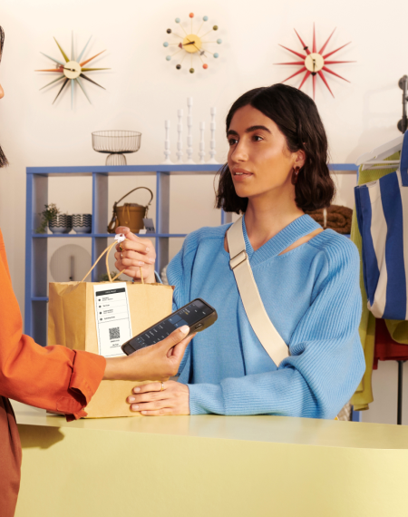
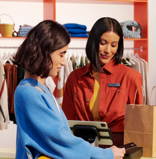
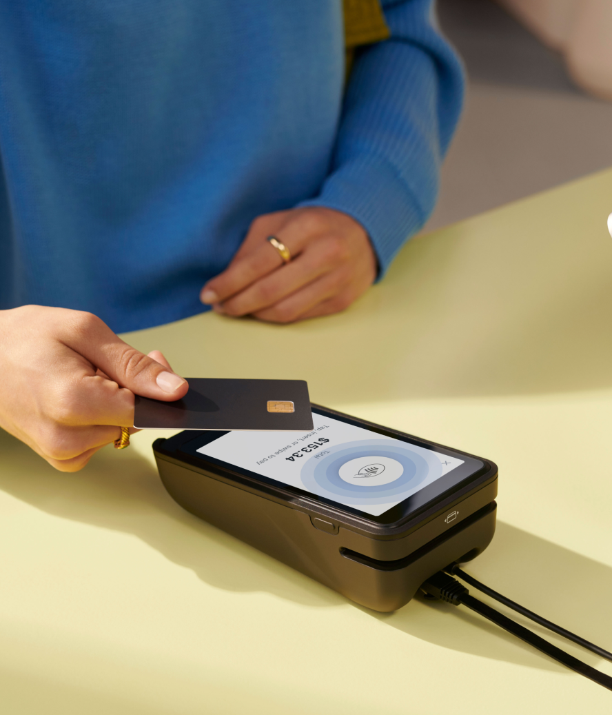
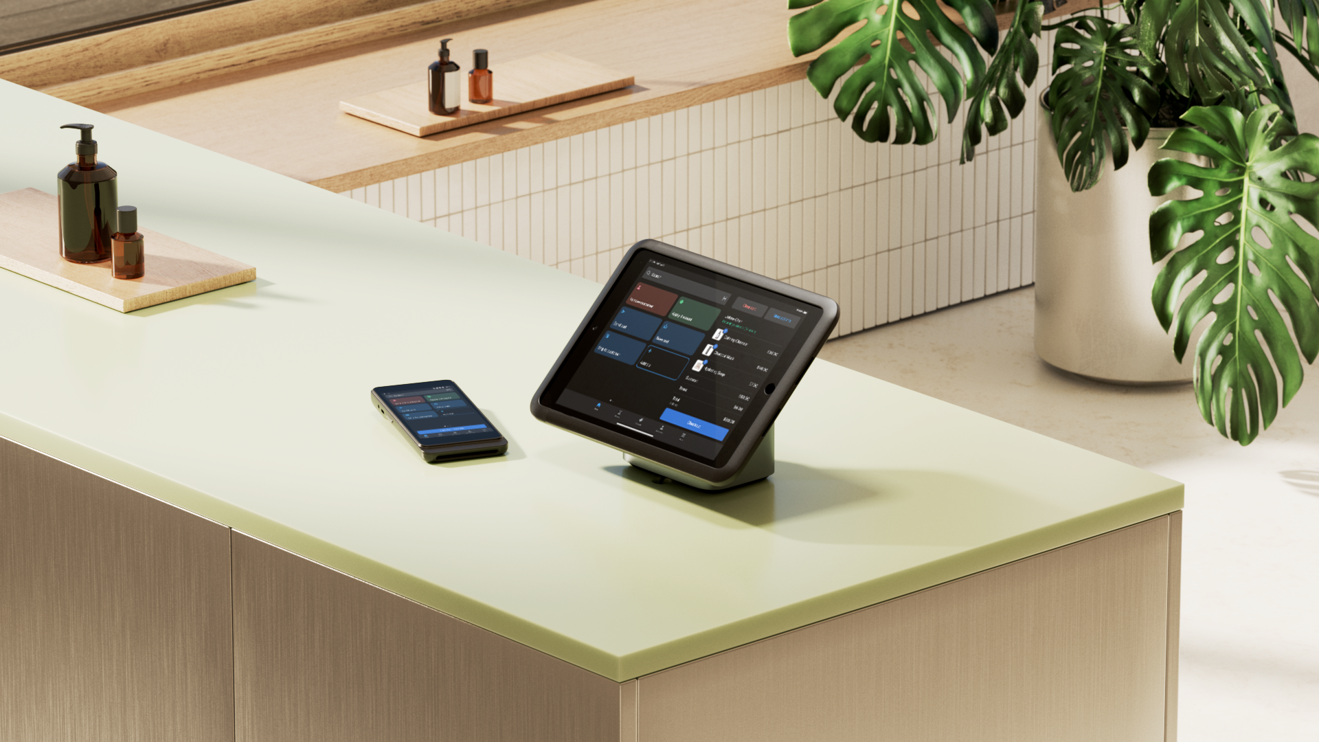
Mobile POS systems and card readers, for example, help merchants modernize their checkout experience and take payments anywhere in-store. Whether a shopper chooses to buy online and pick up their purchase in-store (BOPIS), use Apple Pay, or use a digital gift card they bought online, the checkout experience should feel simple and straightforward.
You don’t have to limit checkout to the counter either. You can use retail design and displays to offer checkout wherever shoppers are in-store. Self-checkout via mobile app, for example, offers next-level convenience.
Retail design trends for 2024
The above retail design tips are tried and true. However, they're not the only best practices. The retail interior design trends below are some up-and-coming ways to engage your shoppers better through your store design.
Personalized retail experiences powered by AI
Interactive and personalized retail experiences keep shoppers in your store longer. Visual merchandising—like a staged seating area—is one simple example of providing interactive shopping experiences. Still, most interactive retail uses AI and digital technology to engage with your customers on a personal level.
Some retailers provide touchscreens for customers to look up product information, discover complementary products, or build custom color packages. The accessibility of AI technology also makes it easier for retailers of all sizes to tap into these opportunities. In fact, personalizing the customer experience is a top driver for 42% of AI decision-makers.
Social commerce
Social commerce is using social media platforms to promote and sell products or services. It lets businesses and customers interact directly, resulting in a seamless shopping experience within the shopper’s preferred social network.
You can tap into social commerce in the retail environment through digital displays that showcase live feeds of UGC from social media, for example. Or, offer a QR code on signage for shoppers to learn more about products on your social media storefronts.
Content creation studios
Content creation studios are when retailers design their stores to double as spaces where shoppers and influencers can stage and capture content for social media.
This benefits both parties: influencers get to use gorgeous, pre-designed studio space for free, and retailers gain exposure for their products and storefronts.

Want to incorporate a content creation studio into your retail design? Sprinkling fun, interactive displays among your products will turn your store into a destination, making it nearly impossible for shoppers not to capture beautiful UGC.
“Find opportunities to give your customers authentic moments to share their experience in your store,” says Lisa Bubbers, CMO and co-founder of Studs. “These can be fun mirrors for selfies with friends, cool installations, like our Ear Chair in Boston, or experiences that they want to share with the world.”

Sustainability
Environmental impact continues to be a growing concern for global consumers. This is likely a reason why the circular economy is top-of-mind for shoppers and retailers alike.
Use retail design to highlight the ways your business is working towards sustainability. Maybe you repurpose items to turn into displays and visual merchandising installments. Or perhaps you offer a rack of used products, similar to how Girlfriend Collective offers its ReGirlfriend Recycling program online.
You can also create displays of local and sustainable curated selections. Whether your customers are local or visiting, they can appreciate it when merchants gather items that are special to or provided by the local community.
A minimalistic approach to merchandising
When it comes to retail, less is often more. You already understand how too much color can dissuade your customers from making a purchase. The same can be said for merchandising and displays.
Just one or two impactful displays can engage your customers better, even if you aren’t merchandising every one of your products (another reason why you should routinely cycle through displays).
If you offer customers the option to buy in-store and ship to their homes, a minimal merchandising approach may also work. In this case, your retail design can double as a showroom, encouraging customers to interact with your products without having to worry if you have every size and color available.
Fashion meets function
Decision paralysis is real, especially for retail shoppers. Most appreciate a smaller inventory from which to shop, which means providing a smaller physical space may be a better fit for your retail design.
But, effective retail design requires a careful balance of minimal, beautiful design and immersive brand experiences. Retailers are becoming more tech-driven, and the pressure is on to create really impactful experiences instead of just spaces to browse and purchase products.
Think about how home goods stores create merchandised spaces for imaginary kitchens, living rooms, and bedrooms, for example. Customers can do pretty much everything but actually use the products in context themselves to get a better idea of how they’d function in their own homes.
Apparel retailers, for example, can offer in-store scanning—shoppers can scan the items they like while staff members start a fitting room with those styles in thor selected sizes. When they’re done browsing, they have a fitting room full of products waiting for them to try.
To do this successfully, you need a handle on your inventory management system. Smaller physical spaces require a larger backstock and more frequent item replenishment as shoppers buy up your items. Confirm your team can manage more frequent restocking.
You can also offer “endless aisles,” where shoppers can buy in-store but have items shipped directly to their homes. This option lets you provide more purchase opportunities without having to physically display everything.
5 retail interior design examples
The Sill
The Sill, which started as an online plant delivery company, has since opened physical store locations. Shoppers enjoy visiting The Sill because the store is designed to make you feel like you can keep a plant alive, regardless of how much experience you have as a plant parent.

The Chicago branch specifically is bright, airy, and designed to guide plant beginners and experts alike around its greenhouse-esque aisles. The additional shelves, signage, and decor only add to the experience. Whether or not you purchase a plant, The Sill’s retail design guarantees you at least leave with a photo.
Outdoor Voices
Outdoor Voices is a popular athletic wear retailer and Shopify merchant. OV is a brilliant example of a few notable tactics: creating exciting displays for UGC, leaving plenty of space to browse, calling out the local community, and using color to engage customers and guide them through your store.

The dressing-room-slash-gym-lockers in the above photo doubles as a space for content creation and gives an intriguing yet subtle nod to the motif and the OV Chicago store: vintage high school gym class. Moreover, the furniture rolls out of the way for when Outdoor Voices hosts events and classes at the store.

The image above features a standout piece of decor from OV’s Chicago shop: a vintage water fountain painted Chicago Bulls orange. The best part? It works, and it’s used by real customers and people who join exercise classes held at the stores.
Wildling
Wildling, another Shopify customer, is a shoe brand based in Germany. The company—which started as an ecommerce business—decided to launch showrooms to bring in more new business and better communicate the physical benefit of its shoes.
Wildling opted for a minimalistic approach to its retail interior design, placing the spotlight on its shoes and leaving ample space for browsing and trying on products. This is important, as the brand lets customers try on shoes and order them directly to their homes.

You can also see the brand leverages checkout displays that engage customers at the point of sale and encourage them to buy more.

Yardbird
Yardbird is a direct-to-consumer outdoor furniture brand that was acquired by Best Buy. It uses a showroom-style approach to retail design, incorporating Shopify POS Go’s mobile features to drive sales.
Associates can guide customers through the store, answering any questions they have along the way. And when the shopper is ready to purchase, they can do exactly that—right then and there. It creates a fast and convenient shopping experience.
Polkadog
Polkadog uses retail design to promote its all-natural dog treats across eight brick-and-mortar locations. Rather than requiring all customers to queue in line at a checkout counter, Polkadog enlists the help of Shopify POS Go to cut down on wait times. It comes in handy, especially during busy periods like the holidays.
Polkadog uses retail design to create an environment where customers almost feel like they have a personal shopper.
Perfect your retail design with Shopify Partners
From the moment someone steps into your store to the time they decide to check out (or leave your store without making a purchase), smart retail design decisions directly impact sales. Think about how you can make decisions that positively impact sales.
Your retail design is a never-ending process. With constantly changing design trends, you can always be switching up, tweaking, adding, or taking away to create a resonating customer journey and experience.
Retail design is a complex topic that may benefit from the help of some tried-and-true experts. If you’re looking to hire some retail industry expertise, make sure you check out Shopify partners to find qualified professionals and agencies that specialize in design.
Read more
- Point of Purchase Displays: How Retailers Can Use POP Marketing to Increase Sales
- 12 Retail Window Displays that Drive Sales
- How to Complete a Retail Store Audit Efficiently (5 Steps)
- Why All Sale Signs Are Red: The Science of Color in Retail
- 10 Visual Merchandising Tips for Increasing Event Sales
- What Retailers Can Learn From These 5 Examples of Experimental Store Formats
- Slow Shopping: Why Retailers Should Focus on Discoverability In-Store
- Why Your Store Needs a Size Chart (And How to Create One)
- Let There Be Light: Retail Lighting Designs to Encourage Sales
Retail design FAQ
What does retail designer mean?
A retail designer is a person who specializes in creating visually appealing and functional retail spaces. They design stores, showrooms, and other retail environments to enhance customer experience, optimize sales, and align with a brand’s identity. Retail designers work on various elements, including layout, lighting, fixtures, signage, and overall aesthetics, to create a cohesive and inviting atmosphere.
How do you become a retail designer?
You can become a retail designer by studying it in college, taking a specialized course, or learning on the job through an internship or apprenticeship. To become a professional retail designer, you may pursue licenses or memberships with the Retail Design Institute (RDI), International Interior Design Association (IIDA), or National Council for Interior Design Qualification (NCIDQ). You can also DIY retail design for your own flagship store.
What makes a good retail design?
- Customer experience
- Brand identity
- Functionality and flexibility
- Visual merchandising
- Lighting
- Sustainability
- Technology
How do you design retail stores?
- Understand your brand, goals, and retail space
- Take measurements and lay out the floor plan
- Design visual merchandising
- Determine materials, lighting, fixtures, furniture, and displays
- Integrate technology
- Bring everything to life
- Measure impact and performance
What are the 6 basic designs for store layout?
Most retail brands tend to lean towards one of the following basic designs for their store layout:
- Forced-path
- Grid
- Free-flow
- Angular
- Loop
- Diagonal


