Good website navigation is critical to the success of your ecommerce site.
The easier people can find items, or naturally discover them, the more you’ll sell.
In fact, intuitive site navigation can positively impact conversion rates by 18.5%. It can also reduce your bounce rate, which improves your search engine optimization (SEO) efforts and helps your page rank higher.
Ahead, learn the best usability practices for navigation design, with examples and tips for your site.
5 ecommerce navigation best practices
- Include information browsers require in your header
- Use an ecommerce navigation search bar
- Add an ecommerce site-wide benefits bar
- Get your navigation structure right
- Design an ecommerce menu that gets results
1. Include information browsers require in your header
Although the header navigation is seen by 99.99% of your visitors, you have the amount of time it takes for their eyes to zip from left to right to anchor their trust and convince them to stay and buy from you.
With this in mind simplicity, colors, and obvious titles are crucial. Typically, the header section, which lives at the top of the page, includes the main navigation, a search bar, a cart button, and additional information like customer service, store locator, top selling items.
Those extra items are determined by your visitors’ on-site behavior:
- If a lot of them are looking for your store locations, add that to the header.
- Customers complaining about how it’s hard to reach your business? Add a link to live chat.
- Running a promotion or special program you’re trying to push more sales for? Add that.
Whatever is most important to you (ideally backed by data) should be in the header.
For one merchant, that might mean running a sales promotion in the header. For another, it might mean live chat and store locations. Just remember that space is still at a premium, so make data-backed decisions based on Google Analytics and other data that clearly shows what people are looking for.
One bigger promo (Free Shipping, Prime Video, 10% off sitewide) and two or three links to other relevant information/content (live chat, store locations and the like) is all you have room for.
Mavi displays its resale service, rewards, a 40% off sale, and a prominent free shipping threshold.

DODOCase integrates its top-selling items into the main navigation bar itself.

Other companies experiment with adding themed categories like “Halloween,” “Christmas Gifts,” “Gift Guides,” and many others to drive traffic and sales to relevant categories at different times throughout the year.
You could also test a dedicated “What’s New” section for frequent buyers/return visitors. They’ll want to see what new products you have without going through the menus or using the search bar.
2. Use an ecommerce navigation search bar
The key to a great search bar is simple: When you sell products that people know to search for, make the search bar more prominent. Think Amazon-style search—big, bold, and the center of the header area.
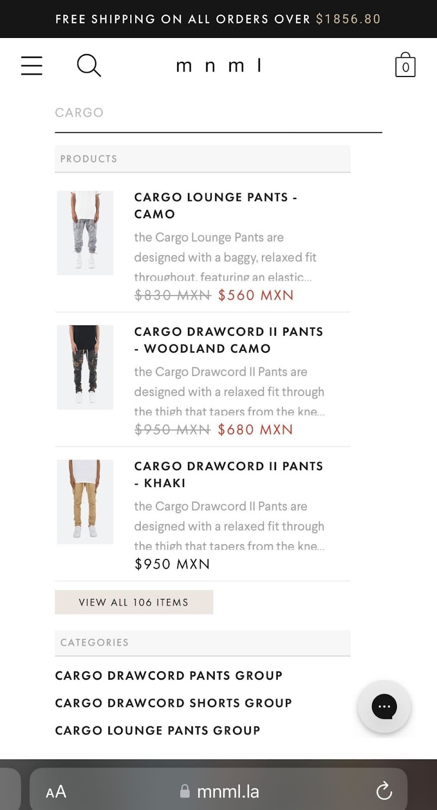
Streetwear brand mnml uses a search bar that recommends popular items in its ecommerce store.
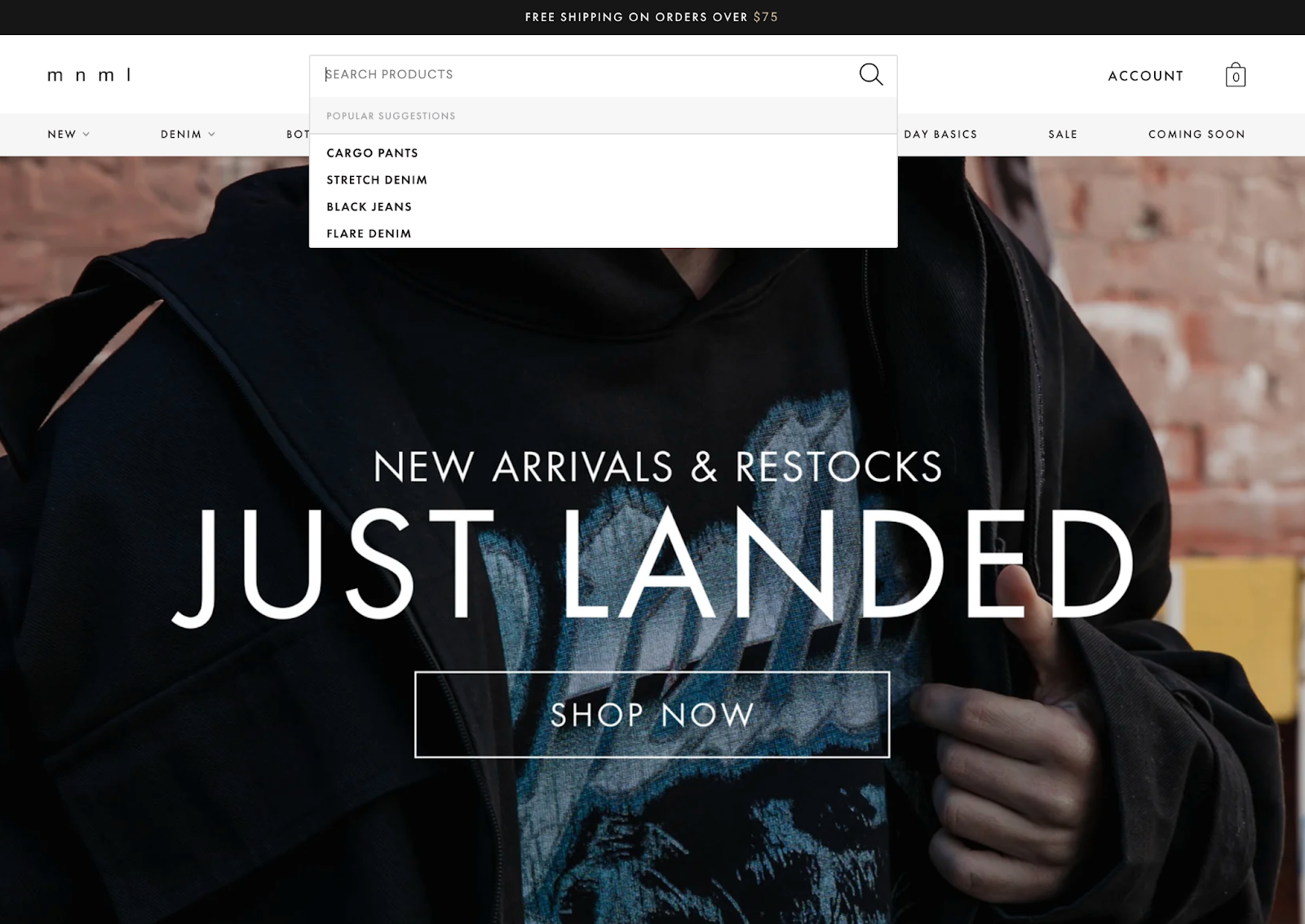
The search function will also autocomplete your search, and match you with items you may like. You can access the product pages directly from the search bar. This feature works on both desktop and mobile devices.
Will it have the same effect on your ecommerce website? Maybe. At the very least it’s an idea for an upcoming test whereby you run a search with text only for a month followed by a month that includes images, and then compare results. Just be sure to avoid the common UX mistakes ecommerce companies make with site search.
If you want to implement smart search on your site, check out the available apps in the Shopify App Store.
3. Add an ecommerce site-wide benefits bar
Now you’ve got a well-designed header (with only the most important information). That’s great, but it’s only the beginning!
Next, include a benefits bar just below the header.The idea is to clearly communicate what makes what your offer unique and the benefits of buying from you over, say, Amazon.
The site-wide benefits bar acts as a trust anchor for visitors who would otherwise feel dissuaded from buying from an unfamiliar brand.
Benefits could include things like:
- Free shipping thresholds
- Shipping time
- Payment plans (buy now,pay later, financing, etc.)
- Geographical info (American-owned, Made in the USA, etc.)
- Or whatever else is potentially important to your customers
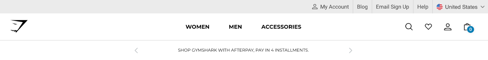
Gymshark, for example, uses a bar that rotates through four benefits:
- Create a habit, change your life. All it takes is 66 days. Sign up to Gymshark66!
- 10% student discount
- Shop Gymshark with Afterpay, pay in 4 installments
- Free 30-day free policy
Culture Kings, on the other hand, uses the same area below the header to add a secondary navigation that includes links to its new arrivals and collections.

This lets fans navigate directly to new merchandise.
Now that we’ve covered the small stuff in the header, it’s time to look closer at the big one—the horizontal navigation menu.
4. Get your navigation structure right
In navigation, proper product categorization (or information architecture) is the name of the game.
By grouping relevant products together you’re making it easier for potential customers to find what they’re looking for. You also make it possible to view and compare a group of products that share a similar set of qualities.
All this makes it easier for the end user to make a purchase.
As for hierarchy, there are two types of categories:
- Parent Categories. A parent category is the name given to a group of subcategories that best describe the shared qualities of that group,
- Subcategories. A subcategory is used to group specific products together. Products such as shoes, hats, and pants.
Sometimes it can be hard to choose the exact subcategory that a given product should belong to and/or it could logically appear in multiple parent categories. For example, users might be looking for a coffee table in the “Living Room,” “Office” or “Tables” section.
How do you choose which one is the most relevant category for the coffee table?You don’t.
Yes, the ideal solution is to have unambiguous top-level categories, but this is not always possible.To avoid missing out on sales (visitors looking for coffee tables under “Office,” but you have it in the “Tables” section only), consider having products and subcategories under multiple parent categories.
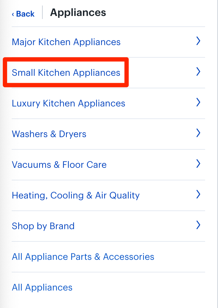
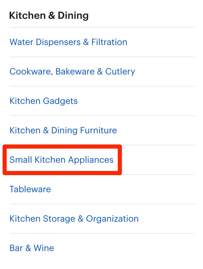
Best Buy, for example, has the subcategory “Small Kitchen Appliances” under “Appliances,” as well as under “Computers & Tablets,” and it makes total sense to do so.
Why make it harder for potential customers to find stuff?
Grouping subcategory options in drop-down menus is vital in making the navigation manageable, scannable, and intuitive. The problem is that many sites use text labels and don’t make sub-header navigation clickable.
Users expect to click and be taken to a particular category, and when that’s not possible, it’s a problem.
Shoppers should be empowered to scan navigation labels and instantly understand what those labels represent. To enhance scannability, start with the most descriptive word and avoid jargon. Labels that are clear and easy to understand are more effective.
Even if you get your information architecture side spot-on, there’s still the question of how to present that information in a clear, clean, and easy to understand manner. This is where mega menus come into play.
5. Design an ecommerce navigation menu that gets results
From the time a user sees your navigation menu on your homepage, you have less than 10 seconds (after all, it takes time to find the menu and click on it) to display a large amount of information in an easy to understand way.
Muck this up and all the hard work done on the header design was for nothing. The challenge is to display a number of product categories at once. In cases like this, Jakob Nielsen of the Nielsen Norman Group recommends the use of mega menus.
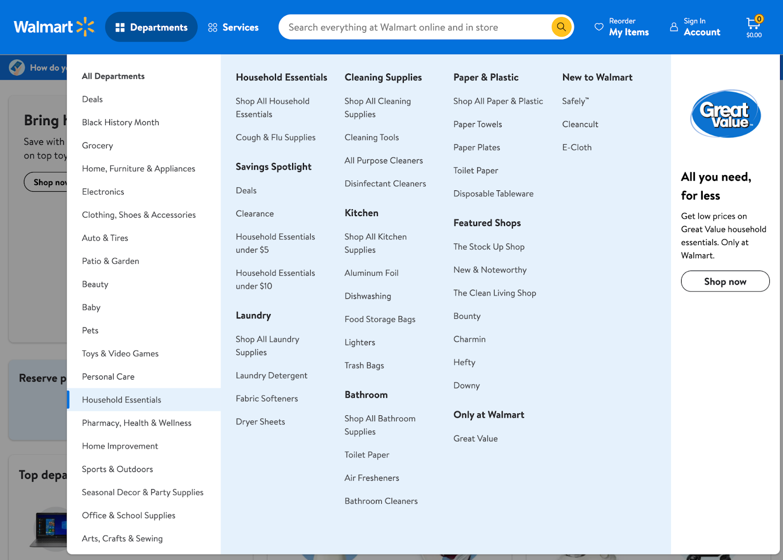
Although the term “mega menu” may not be familiar to you, you’ll definitely be familiar with how it looks. Most ecommerce sites (including GameStop, Amazon, Best Buy, Walmart, and Zappos) with complex categories and subcategories use mega menus.
Mega menus have the following characteristics:
- Big, two-dimensional panels divided into groups of navigation options
- Category hierarchy structured through layout, typography, and (sometimes) icons
- Everything visible at once—no scrolling
What we have above is a user-friendly catalog with many menu items. Click on any of them and you’ll see a new secondary menu.
If you click on “Household Essentials,” you’ll see the subcategories with corresponding links. Navigation options are grouped together and clearly separated and structured, with all options being visible at once without scrolling.
A mega menu makes finding the main categories and subcategories easier and more logical, even when you have too many categories. If you have a huge product catalog, having a clean and simple to use main navigation is crucial for most users.
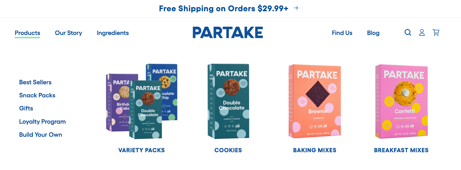
But what if you don’t have 75 million products for sale like Walmart? Smaller retailers, such as Partake, can use dropdown menus to make it easy for customers to discover and buy products.
The top-level navigation looks simple, but customers can see a few top options when clicking it. The Products tab, for instance, shows its bestselling categories, with links to category pages to make accessing those products easier.
Invest in smart web design for your ecommerce business
Generally speaking, to cultivate customer confidence (rather than erode it) header design should be simple, clear, and, most importantly, attractive to your visitor’s perception.
Your header is by far one of the most functional interface elements of your site. So make it count.
As long as you remember the following four points, you’ll do great:
- Conciseness: Header features most important data based and relevant information and links only
- Organization: Proper categorization and subcategories
- Discoverability: If it’s relevant, place a product or subcategory under multiple parent categories for clarity and ease of use
- Mega menus: Use them especially for large inventories
Having a beautiful looking header with just the right information is Step 1. Step 2 is giving browsers a simple, easily navigable menu to help them find what to buy.
Nail these down and you’ll find more shoppers converting at checkout.
Ecommerce Navigation FAQ
What is ecommerce navigation?
Ecommerce navigation helps users move from page to page in order to create a seamless shopping experience. The navigation show has product categories and filters that a user can easily sort and maneuver.
What makes a good ecommerce navigation?
Good navigation will always think of the user experience. The labels and categories are user focused, simple, and easy to understand. A user should be able to see a clear design difference between the navigation and the page.
How can I improve my ecommerce navigation?
There are several ways you can improve your ecommerce navigation, here are four tips:
- Make a top-level navigation that is sticky when the user scrolls the site
- Ensure all labels resonate with a customer
- Include a search function
- Spotlight sales and discounts
What top 5 features are a must for any ecommerce site?
- Navigation bar
- Drop down menu
- Sidebar menus
- Breadcrumb navigation
- Footer menus
Read More
- Ecommerce Chatbots: 22 Ways to Increase Sales, Conversions & Retention
- Ecommerce Marketing Strategies: A Comprehensive Guide for Growth
- Selling $3 Billion on Autopilot: Less Effort, More Growth via Ecommerce Automation
- Scaling a Global Ecommerce Business: Three Keys from $100M+ Enterprises
- How to Use a What-if Analysis to Measure the Effects of Your Decisions
- B2B Ecommerce Features for Acquiring, Selling & Retaining Customers
- Black Friday Facebook Ads Guide from $6.8M in Ecommerce Holiday Spend
- Dynamic Pricing: The Art and Black Magic of Situational Pricing
- Native Advertising for Ecommerce: From Content Discovery to Scaling Sales
- How to Avoid the Hidden Cost of Black Friday, Cyber Monday Sales and Increase Customer Lifetime Value through Personalized Email