Visitors will not buy what they can not find.
We have evolved into an unforgiving species of intolerant mega-consumers willing to abandon any website that does not immediately engage our silent inner-dialogue.
If the visitor does not see a clear path to the item they’re looking for, they leave. If the visitor finds the website difficult to use, they leave. If the visitor gets lost, they leave. If the visitor doesn’t have their basic questions answered, they leave.
A million websites selling the same stuff created the conditions for this elitist behavior — and as consumers, it’s great, right? But when the tables turn, and you’re the seller, guiding “the visitor” to purchase feels like whispering into a fog and hoping they’ll follow your direction.
This is where usability testing comes in. According to leading consultants Nielson & Norman, there is an 83% average gain of business metrics - like conversions and pageviews - after employing usability improvements.
Older reports from companies like Creative Good found that usability improvements increased absolute buyers by 40% and average order values by 10%. An added bonus, improving usability can also be a significant decrease in support debt, as evidenced in the case of Jones Soda.
What is the Definition of Usability?
Simply put, it’s the practice of making your site more intuitive and easy to use.
According to Nielson & Norman, “usability is defined by 5 quality components:”
- Learnability: How easy is it for users to accomplish basic tasks the first time they encounter the design?
- Efficiency: Once users have learned the design, how quickly can they perform tasks?
- Memorability: When users return to the design after a period of not using it, how easily can they reestablish proficiency?
- Errors: How many errors do users make, how severe are these errors, and how easily can they recover from the errors?
- Satisfaction: How pleasant is the design to use?
Usability is also defined by utility. Does the design do what you need it to do? Are links easily distinguishable from regular text? Do navigation items use plain language to describe their function? Is the search bar in an easy to identify the location? Is the typeface legible at a reasonable viewing distance?
Written out these and the thousands of other usability questions appear elementary, no doubt, and I wouldn’t blame you for dismissing them out of hand.
However, if you’ve ever had to “teach” someone how to use your website or show them how to find a new product, you can benefit from usability improvements.
Why is Usability Important?
Companies who spend on average 10% of their design budgets often see more than double the improvement in key performance metrics.
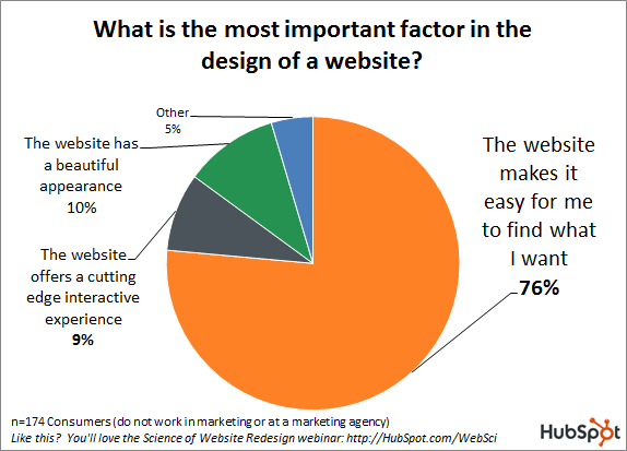
A 2011 study by Hubspot found that 76% of consumers said that a website that makes it easy to find what they wanted was the most important factor in website design. Conversely, only 10% answered that the website needed to have a beautiful appearance.
While it’s easy to understand why online businesses give disproportionate credit to design aesthetics, this kind of thinking deceives stakeholders into believing the only way to avoid stagnation and improve sales is to deploy big sweeping redesigns every 3-5 years.
However, even Marks & Spencer, a 133 year old, publicly traded and respected brand, who spent two years and £150 million on a website redesign isn’t shielded from the negative impact this kind of misguided view on design can bring.
After launching the new design, conversions dropped by 8% and the company was met with loud and scathing backlash from regular customers.
The most vocal complaints were about the site’s usability; more specifically, that all of the familiar navigation and interface elements disappeared literally overnight.
How to Improve The Usability of a Website
There are a number of methods - such as eye-tracking, as discussed earlier this week - but the most accessible is user testing. To paraphrase Nielson:
- Get hold of some representative users.
- Ask them to perform representative tasks.
- Observe what they do, where they succeed, and where they have difficulties. Let them do the talking.
That last part - keeping quiet while observing the visitor - is the trickiest, but vital to the maintain the integrity of the test. If you help or direct, you spoil the test results.
Fortunately, user testing can be done quick and cheap - as tests can be performed with small groups of individual users. The most critical usability problems typically make themselves known with the first 5 people you observe.
To start making usability improvements right away, follow these steps:
- Test your existing design. In your office, ask a user to navigate to an area your site, find specific products, or select a relevant size or variants. Ask them to think-aloud. Record the amount of time it takes to perform each task and identify the parts you should keep or emphasize and the bad parts that give your visitors trouble.
- Test your competitors’ designs using the same methodology to get free data on different interfaces working toward the same goal as your own.
- Conduct a field study where you observe a customer in their own environment.
- Make low-fidelity paper prototypes or wireframes of one or more design ideas to test with your users.
- Refine the ideas that test best into higher fidelity mockups or simple tests that can be run through a testing tool like Optimizely until winning ideas prove worthy of being in the final design.
- Test again once implemented into the final design, as minor usability problems always manage to creep into the implementation stage.
How Often Should You Perform Usability Testing?
The short answer is the more frequent, the better, though it depends on your company’s tolerance and resourcing for implementing a testing program.
Something to consider as you’re mapping out your priorities; in 2014 VWO found that on average, 1 out of 7 conversion tests yielded a statistically significant result. The most active companies were setting up 600 A/B tests in the span of 3 months - a rate that was 8x higher than the average user.
Though different, conversion and usability tests are related in a sense they are intended to help users perform tasks and achieve a goal. Because each A/B test acts like an entry to a lottery where there’s an 1 in 7 chance of winning, the more usability tests you run to inform your A/B testing strategy, later on, the better your odds are at creating winning test variants.
Many usability experts recommend getting into the habit of running one test a week with 4-5 users to improve the usability of very specific areas of your website.
Final Thoughts
Trust, I feel, is inherent when a visitor first lands on your website. We’re not clicking on ads, arms crossed, judging websites and harshly demanding they prove their worth.
It’s quite the opposite, isn’t it? We get hooked on an idea and want everything to work, to distract us, and allow us for a moment of temporary release, knowing that if we buy this thing our story will improve in some major or minor way.
It’s only when the nearly imperceivable elements feel off - like a tiny typeface or an out of place button - that our internal dialogue pivots from the marketing driven daydream to one of rational skepticism.
It doesn’t need to be this way for your visitors. You can continue building that fantasy for them. All you need is a notebook, a handful of questions, and some ideas of where to look for improvements.
Read More
- The 4 Words at the Root of All Meaningful Client-Agency Relationships
- Ecommerce Agency Automation: Saving Time, Selling More & Launching Faster
- 17 User-Generated Content Examples and 5 Tactics to Grow $15M+ in Annual Sales
- Native Advertising for Ecommerce: From Content Discovery to Scaling Sales
- How 3 Brands Scaled Their Ecommerce Subscription Model 100-350%
- Cash Flow Management Strategies
- 5 Easy Tips For Getting Started With Conversion Rate Optimization
- Ecommerce Marketing Strategies: A Comprehensive Guide for Growth
- International Ecommerce Strategy: New Tools to Simplify Global Growth for High-Volume Businesses